Well, in the blink of an eye it’s that time of the year again!
I hope all of you have had an excellent 2017 thus far, and enjoy a well deserved break if you are lucky enough to have some time off over the Christmas and New Year period.
Thanks for all of your support and the fabulous interaction of which I have thoroughly enjoyed, and look forward to more of in the new year.
Super lucky to of found this amazing sample book of vinyl upholstery for transport and upholstery trades just last week.
Great selection!
Dating from the 1950’s the book contains 60+ samples of vinyl showcasing different textures, patterns, colours and finishes.
Nice blurb
See just a small selection below.
How good!
It’s amazing to recognise so many of the patterns and colours from the book on different pieces of furniture I’ve dealt with over the last 10+ years. However I must say my favourite was towards the rear of the book, and appears to of been a late inclusion as it is fixed differently to the other samples.
Mid Century Madness!
As you can see, this finish is called ‘Satellite’ and definitely has a strong atomic influence. Reminds me very much of those 1950’s French coat/cloth/hat racks by Roger Feraud.
Well, in the blink of an eye it’s that time of the year again!
I hope all of you have had an excellent 2016 thus far, and enjoy a well deserved break if you are lucky enough to have some time off over the Christmas and New Year period.
Thanks for all of your support and the fabulous interaction of which I have thoroughly enjoyed, and look forward to more of in the new year.
We will be taking a break from the online side of things for a few weeks, however will still be contactable via email & mobile (just may be a little slow in replying).
Yes, what indeed are we looking at……………………? Well if we pan back a little, you’ll see that we are feasting our eyes on some amazing etched glass doors that depicts a lovely forest scene with everyone’s favourite mid century animal – deer! And not just one, but 3! Buckincluded!
Full Scene!
I’d dare to have a guess and say that they didn’t quite match the new style that the renovators in question had in mind for their 1950/60’s home so out they came, and luckily for some, straight into my arms!
Doors and shower screens seem to be the most common areas to find these etched glass images, ranging from mermaids to bushmen, under water fish to ships however I’ve rarely seen such a large scene stretched across 2 doors and its 2 sidelights.
With no active plans for them at this stage, I think I’ll just store them until I find a use, or alternatively, until someone comes across this post, falls in love and wants them for their own home restoration! If thats you, contact me here.
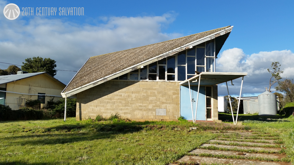
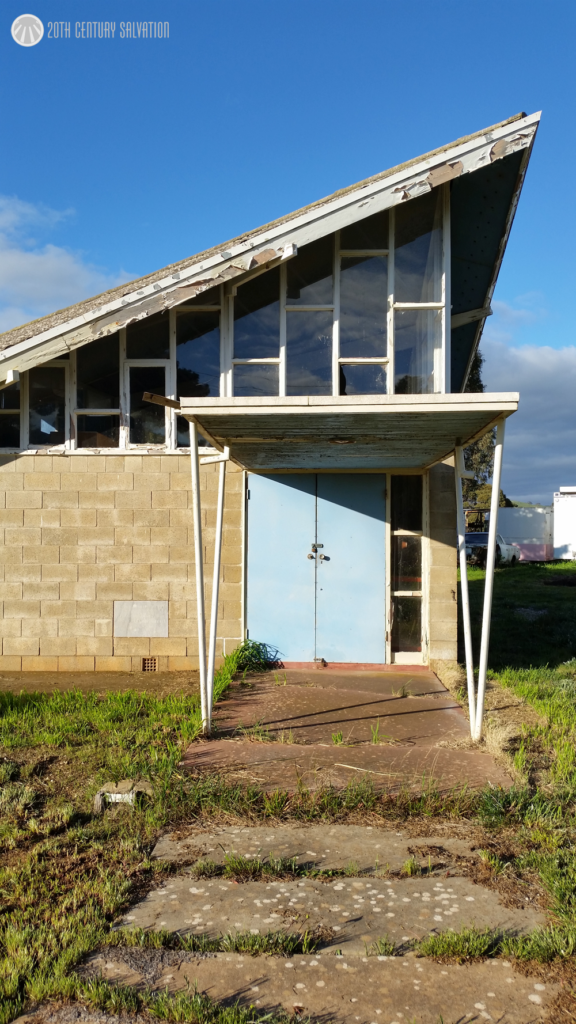
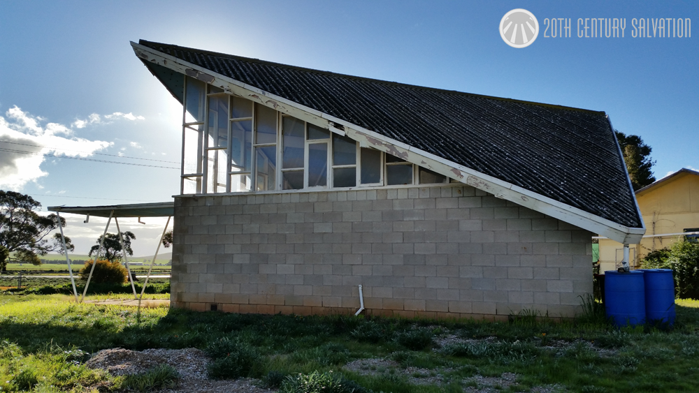
A few weeks ago I was in S.A for work, and whilst travelling to my destination I passed an absolutely amazing piece of Mid Century architecture in possibly the most uncommon place.
Now I’m no expert by any stretch of the imagination when it comes to mid century architecture, and I know that you know my core business is mid century furniture and home decor, however I had to share, especially after a reasonable search online brought up practically no information or images.
Surrounded by vast grazing/cropping pastures and century + old stone buildings Hallett was the last place I’d ever expect to see such a building.
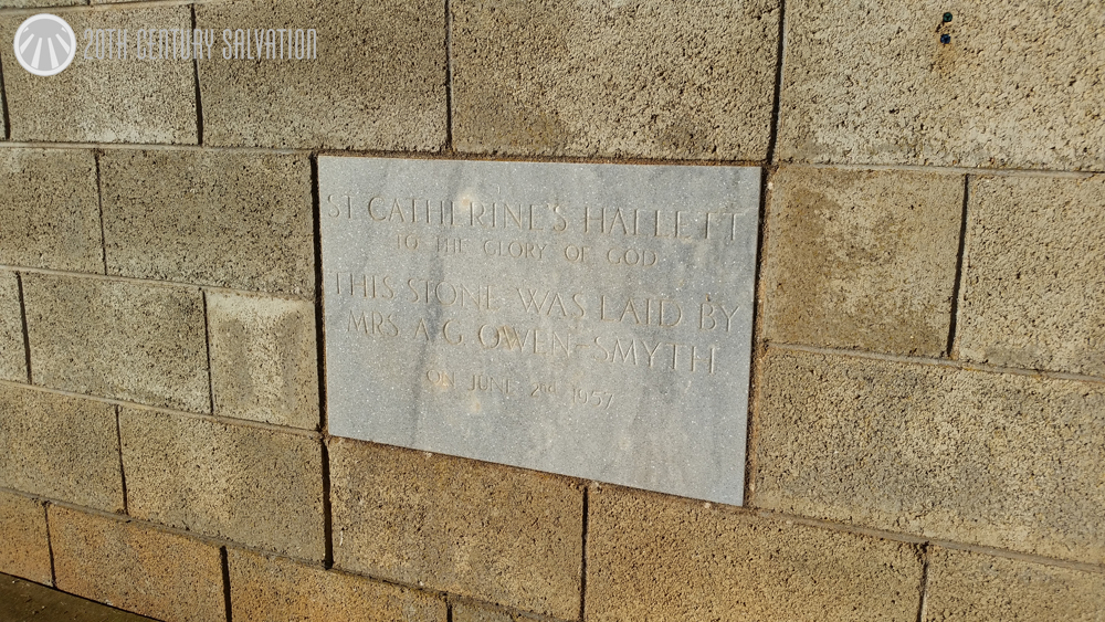
After rubbernecking like I never have before, a swift U’bolt was undertaken to have a closer look. The foundation stone provides an exact date – 1957. And the little information I found online describes the Church of England consecrating St Catherines of Sienna on the 15th September 1957. It was officially closed in 2003 when it was sold and is now a private residence.
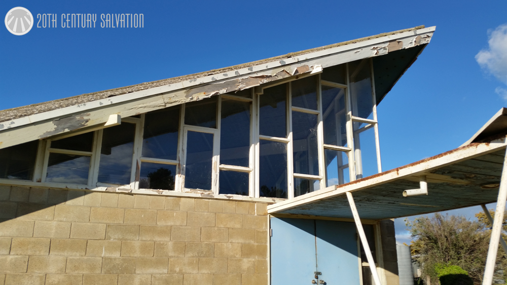
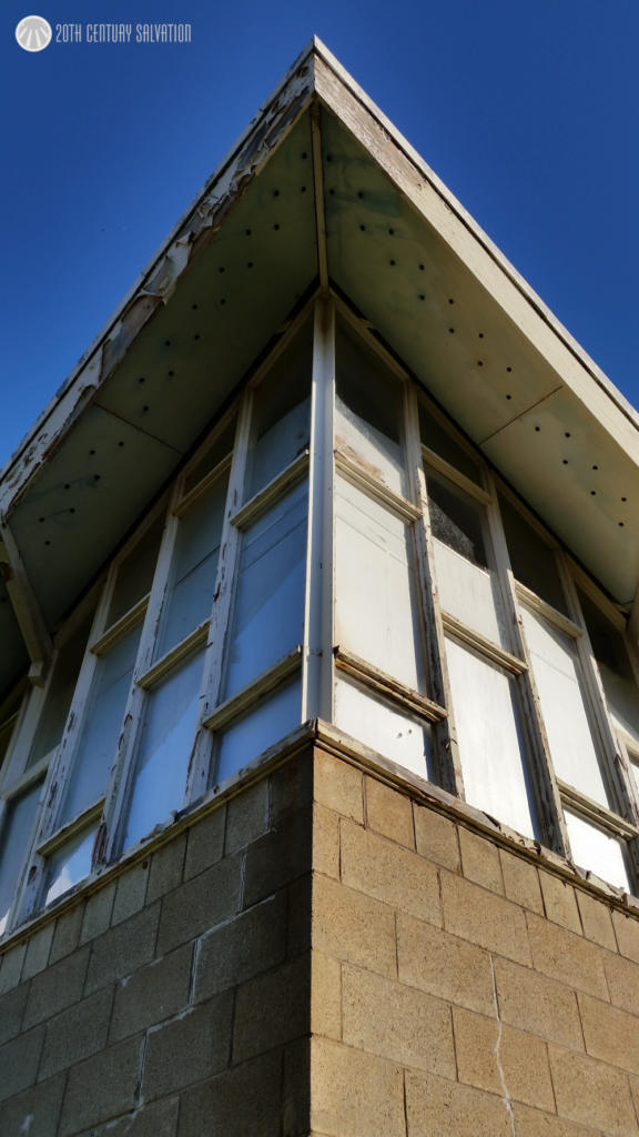
Unfortunately it needs some serious attention, and currently appears to be only used as storage.
aCUTE!
I can only imagine how magnificent the inside space would of been in it’s day with all that natural light flooding in. A heavenly experience in a far out building I’m sure.
#NoFilter
If you’re ever in the region, you can find it yourself just before/past the Toolangi road turnoff on the Barrier Highway.
How do you like my gate? I like it. I like gates in general. But they have to show some element of design.
Art Deco Design
It’s always funny how once you see something, it cannot be unseen, and this rule definitely applies for gates and fences. That’s how I first noticed this design/type of gate on a local house in town, and how it shares a great resemblance (when turned on it’s side/upside down) to our logo. So naturally when I come across this one at a scrap steel merchant I had to have it.
I’m not overly sure what I’ll do with it just yet. Ideally I’d love to find another single and hang both side by side on a wall in a possible/future bricks and mortar store. Guess time will tell!
Similarities.
If you’re interested, on your next trip to work, or walk around the block with the dog take a little time and check out some design features of the gates and fences on the older homes (1940’s – 1960’s) in your area. I’m sure you’ll be surprised at what you see!
I recently picked up this beautiful little TV lamp whilst on holidays. After spotting it in a local retro/vintage shop I knew it had to be mine, so after exchanging some currency it was packed away in my suitcase and safely made the 2500km trip home with me.
I definitely didn’t appreciate just how amazing the projection of light is from this little lamp. It shoots a really crisp line of light illuminating everything below the shade, whilst casting a shadow above.
Tripod Legs! Always a favourite.
Along with it’s crisp line lighting ability, we have the simple yet always amazing ‘tripod’ base which is just so cool.
Unmasked from the darkness!
The top hat (shade) is another impressive piece of design, which looks to be floating above the lamp itself when illuminated, almost like a UFO! Combined with the tripod base the proportions of this TV lamp for mine makes it one of the best I’ve seen.
No, I’m not yelling at a man (or woman) being chased down the street by my trusty K9 companion after she caught them snooping around our back yard, I’m talking about this 1980’s (1979 for this version to be exact) board game.
Not wearing sunglasses? No liability here!
Now you may think I have a ‘thing’ for board games, just like I have a ‘thing’ for big lounges, but you’d be wrong. It just so happened that after featuring a 1960’s version of Twister on the blog a few months back (you can see that post here) I thought it’d be cool to share some images of this board game.
The first thing you notice, and the thing that attracted me to this game is that awesome cover art on the box – ‘STOPTHIEF’ in big, bold capitals varying in colour from purple to red to orange to yellow. To me that just screams 1980’s. It is really cool to compare to the 1960’s Twister board game. Both styles extremely different, however each is
unmistakeable identifiable.
After you’ve dusted yourself off after being sucked in, and than spat back out by that cover art, we find that this board game was quite revolutionary, in the fact that it was one of the first games to bring an electronic device into the game play. Pretty cool eh.
Complete, always a positive!
Now without boring you on the finer details, basically the game play involves you, the detective finding a thief who is computer controller. How do you find a thief that is controlled by a computer? With your electronic crime scanner of course! The game itself does actually sound pretty fun, and perhaps something to break out on a cold
winters night in front of the fire to get away from all the modern day technology (irony much?).
Whilst doing some research, I did come across a nice video segment on the Collectors ABC which relates to a collector and his board games, and specifically features the STOPTHIEF game. If you’re interested in viewing, you can find it here.
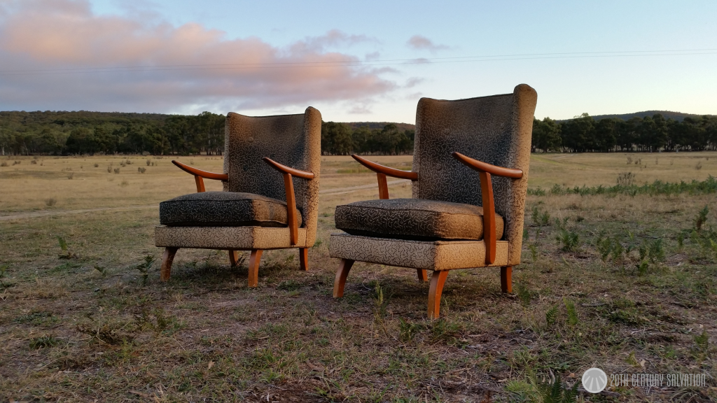
Struggling to find an Auction Watch item this week, so I thought I’d share this picture I took just recently of a pair of 1950’s wing back chairs before I put them into storage for a little while.
What do I love more than great quality mid century furniture? Catalogues for said furniture! It’s always great to come across an original piece of advertising, which happened when I came into possession of an ATEL wall unit a few weeks ago. The unit is currently dismantled and stacked atop of my car in the shed, however tonight I thought I’d share a few images of the ‘Personal Plan Series’ unit chart and model calculator as the ATEL wall units have been a topic of discussion in a few social media groups over the past few weeks so thought it would be fitting!
ATEL unit chart and model calculator!120 different options!
As you can see from the above picture, this brochure listed 120 varying cabinet/shelving units that you could mix and match to produce the wall unit of your desire! Another really great feature is that all the prices are listed below, giving an accurate cost of each unit.
The unit that came with this brochure was 10 ft wide, and 2 units tall, and cost $361 in the early 1960’s. According to the bureau of statistics, the average male wage at the same time was between $30 – $40 a week. Do the math, these were not cheap units!
I thought I’d finish off by posting an image of one ATEL unit currently for sale on Gumtree for appreciation. Beautiful! Now just to find a wall big enough!